IGN Ent. • 2014-Present
IGN First Branding


piece from a presentation on brand@ign
Origins + brand@ign.com
Early on in my career at IGN i was able to establish a division within its design org called brand@IGN which handled the management of the guidelines for IGN as well as the accommodation and structure to create branding, logos, art direction and other services as the years went on. IGN First and its branding was the kickoff of this division and led to a longstanding relationship with the IGN editorial team for my near 8 year tenure

the final logo for ign first
ign 2014
Colors Of The Rainbow
The branding for IGN First was always meant to be minimal and a sub brand of the main IGN logo mark. With that in mind i chose to of course lead then with IGN being the largest item in the hierarchy of the design. What i made stand out was the "F" in IGN First as a vehicle to add variety into each new month of coverage
One thing that was removed was the d-pad design from the full IGN logo for this variation. This was done because with the d-pad element included, the logo was difficult to work with due to how unbalanced visually the full "IGN" + icon are.

ign first: Horizon 2
ign 2014
ign first: Horizon 2
ign 2014

ign first: Horizon 2
ign 2014
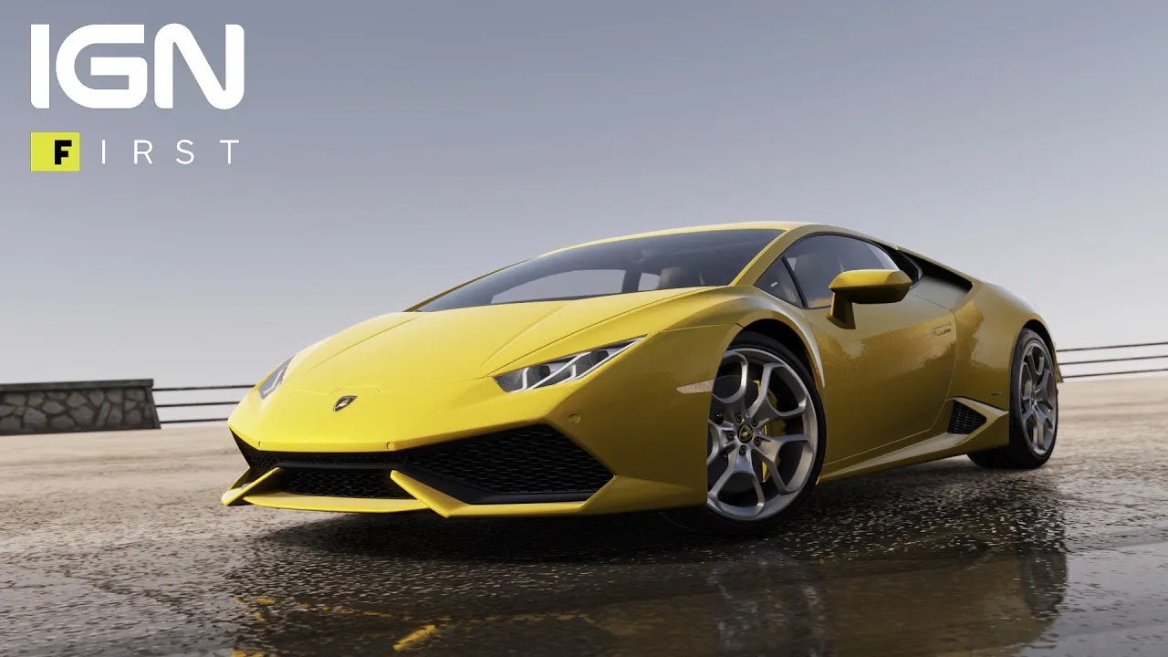
The Initial Launch
For the launch of IGN First we know that we needed to do something that would make headlines so we partnered with Playground Games to help them announce the long awaited sequel to Forza Horizon. IGN made headlines as a publication announcing something important in just the way we had hoped.
We had achieved our magazine cover success for a digital age. The success and traffic of the Forza Horizon 2 feature reached almost 9 million viewers and 74MM impressions alone. This showed to developers and publishers alike that choosing IGN to go to for your cover story could be just as viable for any game

ign first: destiny
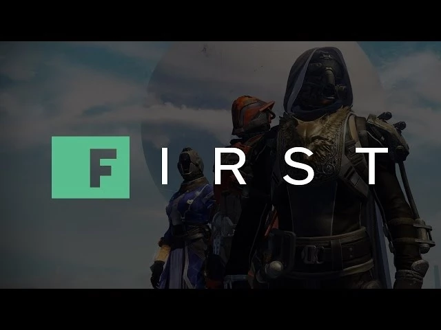
ign first: destiny
ign 2015
ign first: destiny 2 a few years later
ign 2018
Motion Graphics
By the time we launched our 2nd game featured, which was Bungie's newly revealed Destiny. With that reveal also came an upgrade to our coverage with a new motion graphics package that i art directed with our then designer Adam Barenblat
Adding this gave the package even more flair than before and is still in use to this day.


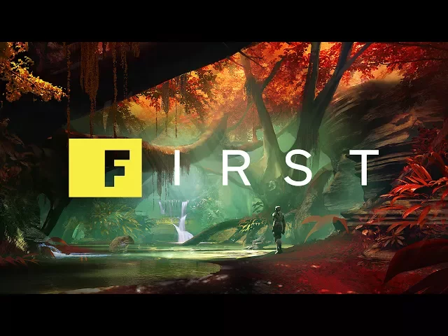
some of ign first's biggest covers over the years
Digital Magazine Covers
As the years went on and IGN First's coverage amassed, i felt like there wasnt really any leave behind or piece the developers/publishers could have as a piece to point to. I started to develop these designs that each participant would get at the beginning of coverage and would help make the whole project feel more official
This was as close as we could get to having our own version of the Gameinformer magazine cover and i feel like it serves as an effective statement piece for the brand and IGN