IGN Ent. • 2020
IGN Best of 2020
Role(s): Lead Designer, Co-Art Director
IGN's end of year coverage is a tentpole event for the brand every year. Just like with 2019 I wanted to represent the year's best content in a way that still gave IGN its own voice and aesthetical representation
My Responsibilities:
• Best of 2020 logo
• Thumbnail design strategy/execution
• Motion graphics art direction
• Promotional design strategy/execution
• Social design strategy/execution
With this project i worked very collaboratively with another designer on my team Angela Nguyen as Co-Art Director. Along with Julia Rago (another designer at IGN on the social team) we ideated this concept. The approach was that we wanted to make our coverage look like it was out of bullet journal or sketch book. We leaned heavily into sketchy hand drawn elements mixed with grid paper as well as paper rips being used for the image crops.
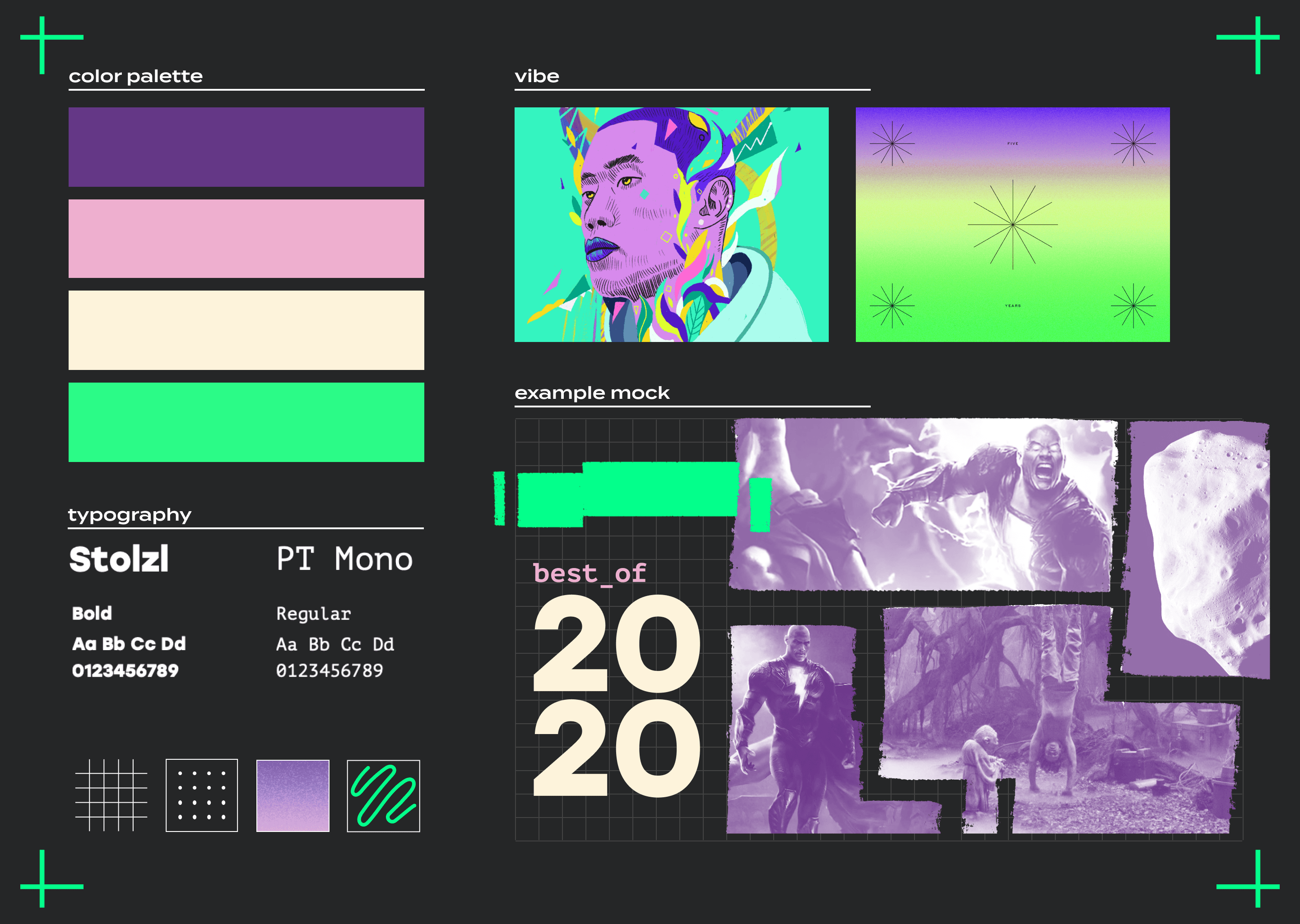
Again i worked on this project collaboratively with my two designers Angela Nguyen and Julia Rago to come up with the feeling and overall art direction for this year. Angela herself served as co-art director for this event and it was a great experience to help someone lead the way. She created this mood board with Julia after our discussions and ideation
an early design for the goty graphic
trying to find just the right look for 2020
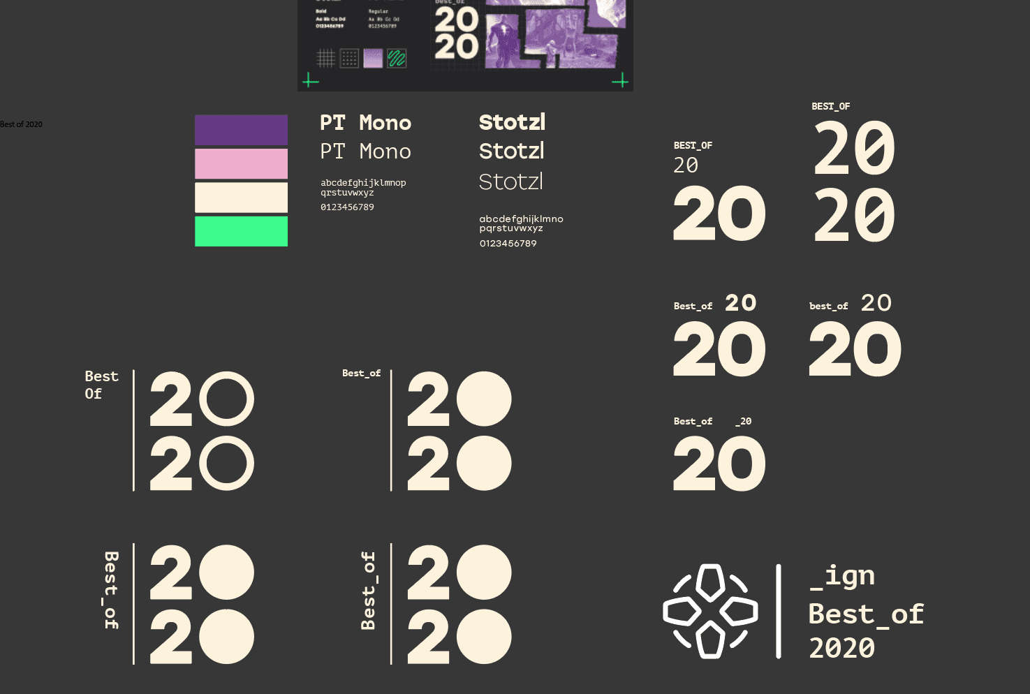
The early process of creating brands and logos for any project is always the most exciting for me. Laying out some fonts and matching them together and that whole discovery process is where so many sparks of inspiration can occur.
another early editorial design
From an early point we knew that we wanted to use these brush strokes as image crops of some kind to show the different games/ent items. In the end (as you can see below) we went with a few variations of brush strokes and shapes for our crops but it spawned from this initial idea and the mood boards by Angela + Julia
Game Mess Mornings
MGFX: will batchelor
This was a year where we went above and beyond with assets for our own owned and operated coverage but also for our partners too. What was important to me with each asset was pushing the best of 2020 brand, the category and the winner itself. As long as those were always clear visually i knew we had succeeded from an art direction standpoint
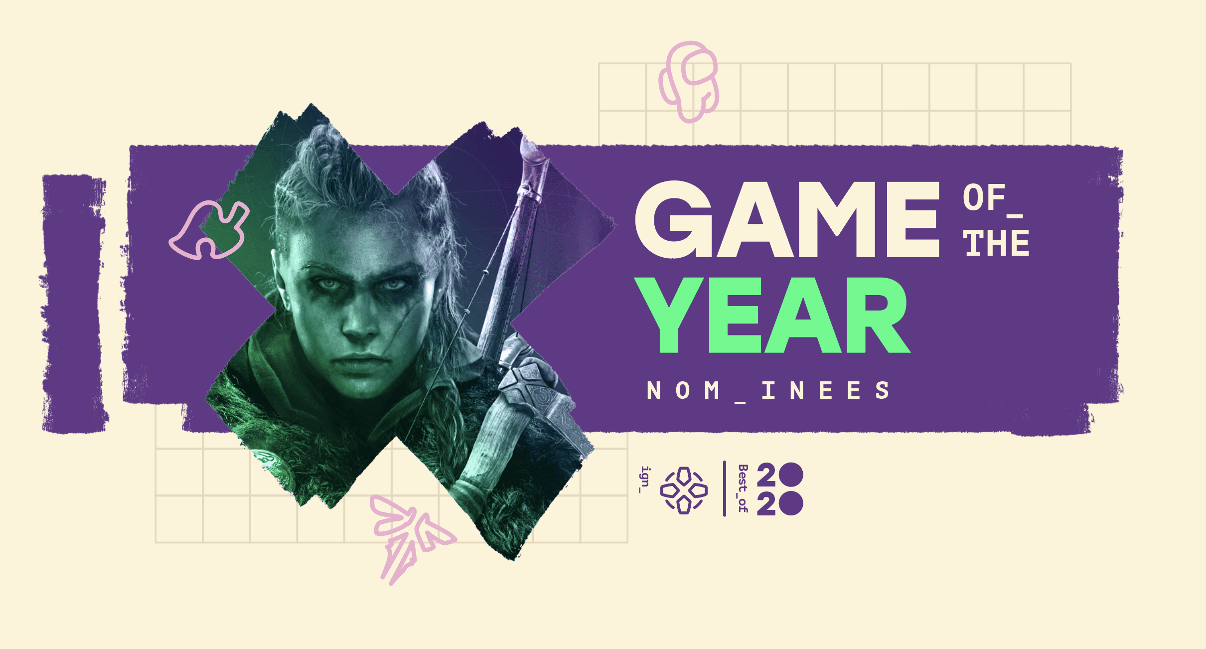
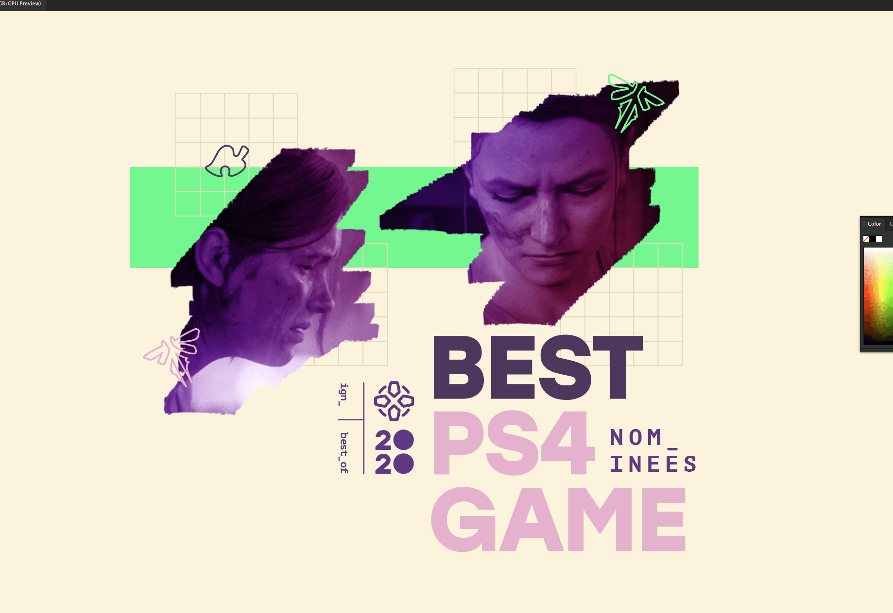
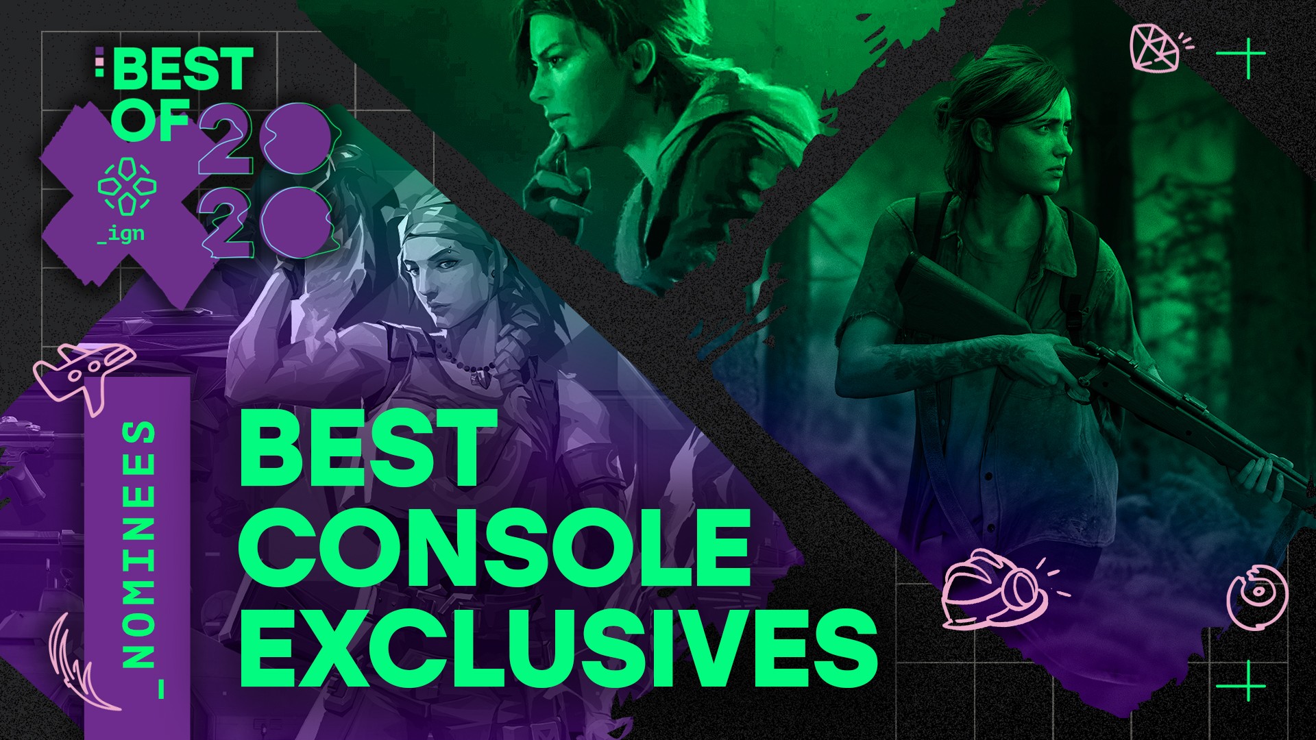
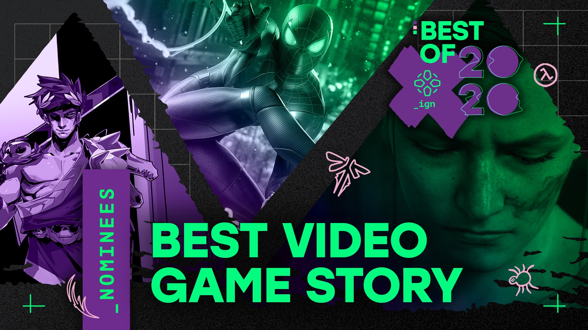
examples of the darker nominee thumbnails
One of the ideas we had from the start of our pitch to the editorial team was that our nominee and winner art would be distinctly colored so that at a glance it was easy to tell the two apart. The first set of assets (of which there were many due to the sheer amount of nominees) would have a dark background approach while combining the shape crops corresponding to each category
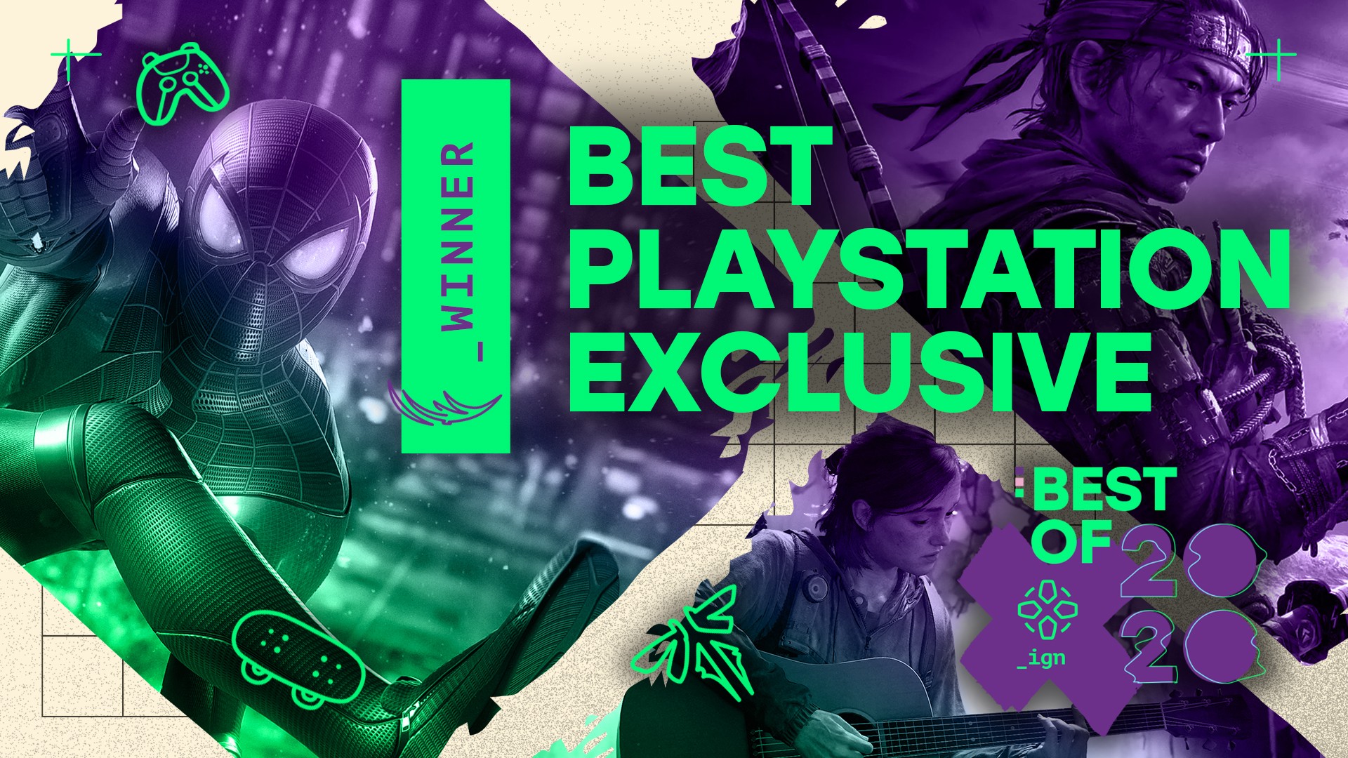
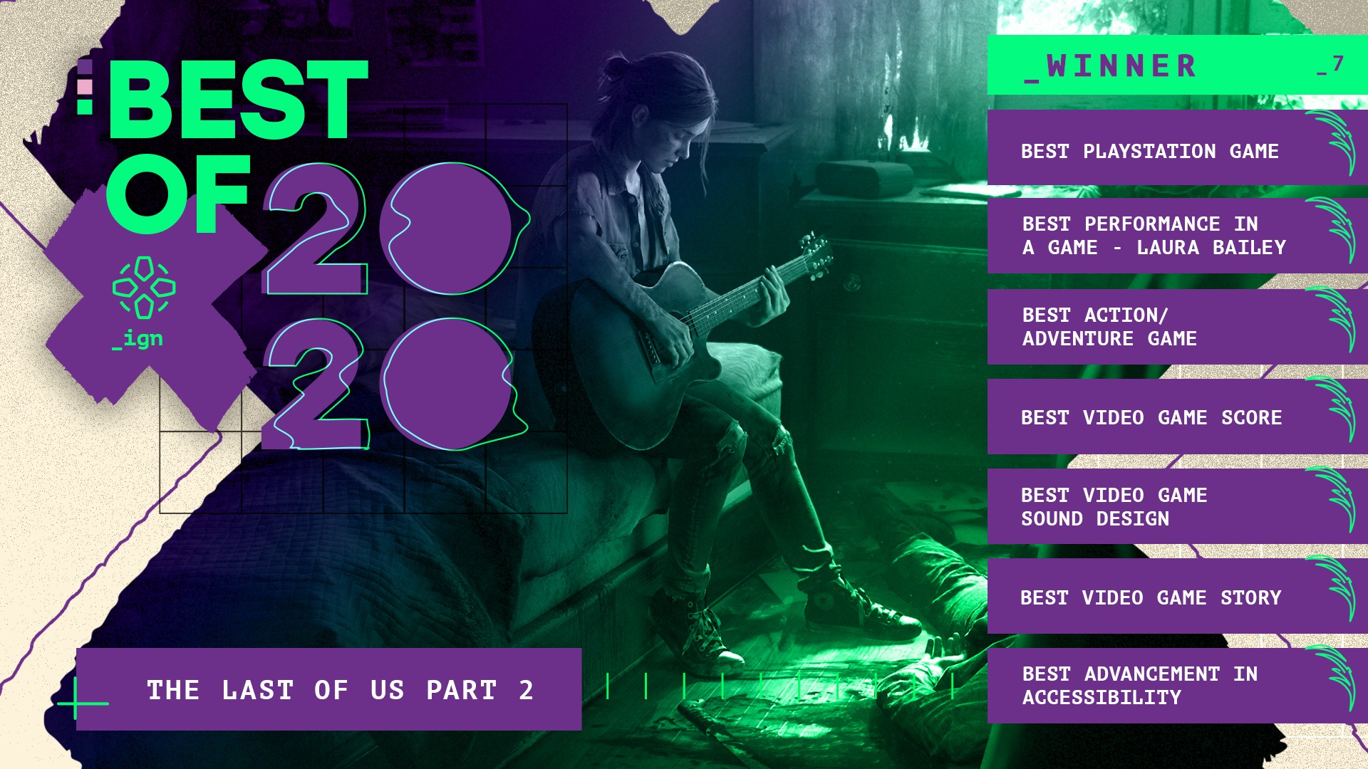
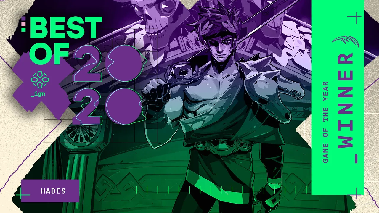
the lighter winner thumbnails
The nominee thumbs being so dark made it an easy choice to go with a lighter cream colored approach for the winner assets. This lighter shade luckily worked very well with the purples and greens we had been using.
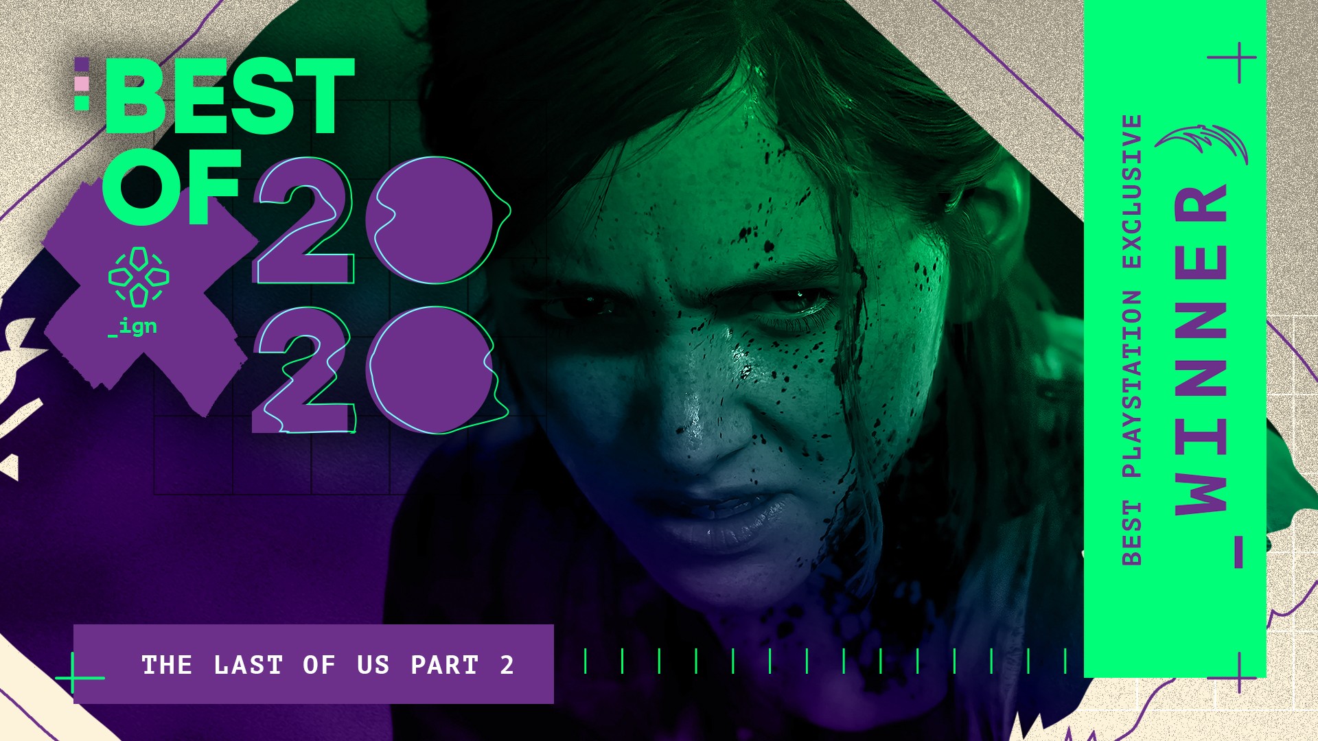
the last of us part 2 toook home the most awards in 2020
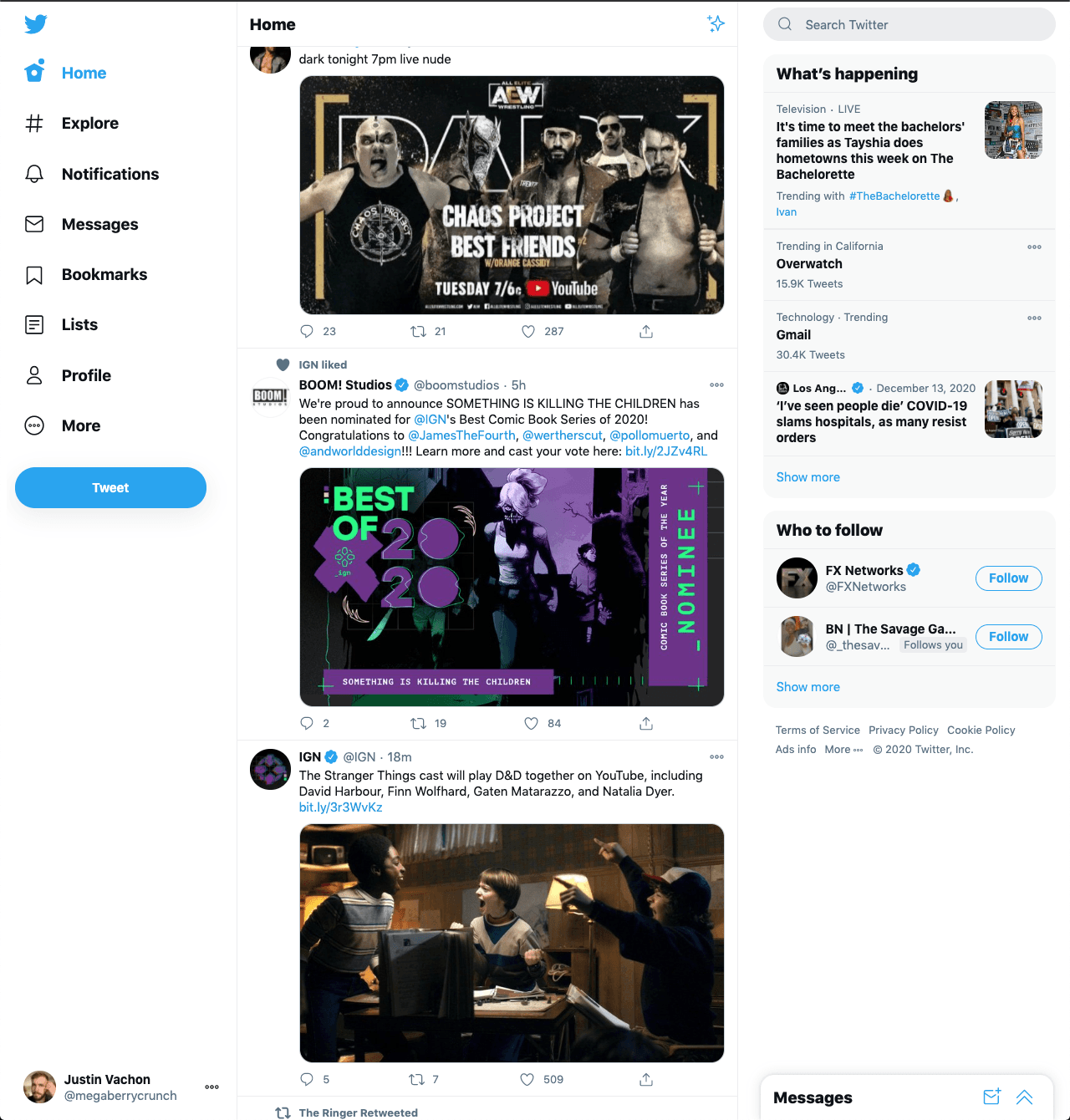
developers sharing their nominee art on social media
This was the first year we at IGN chose to make assets for every single nominee we had that year. This was mostly a social and brand play from our perspective like many of our competitors have done over the years. Getting to have the IGN brand (and feature exposure) being shared out by developers and publishers was a perfect storm of promotion.
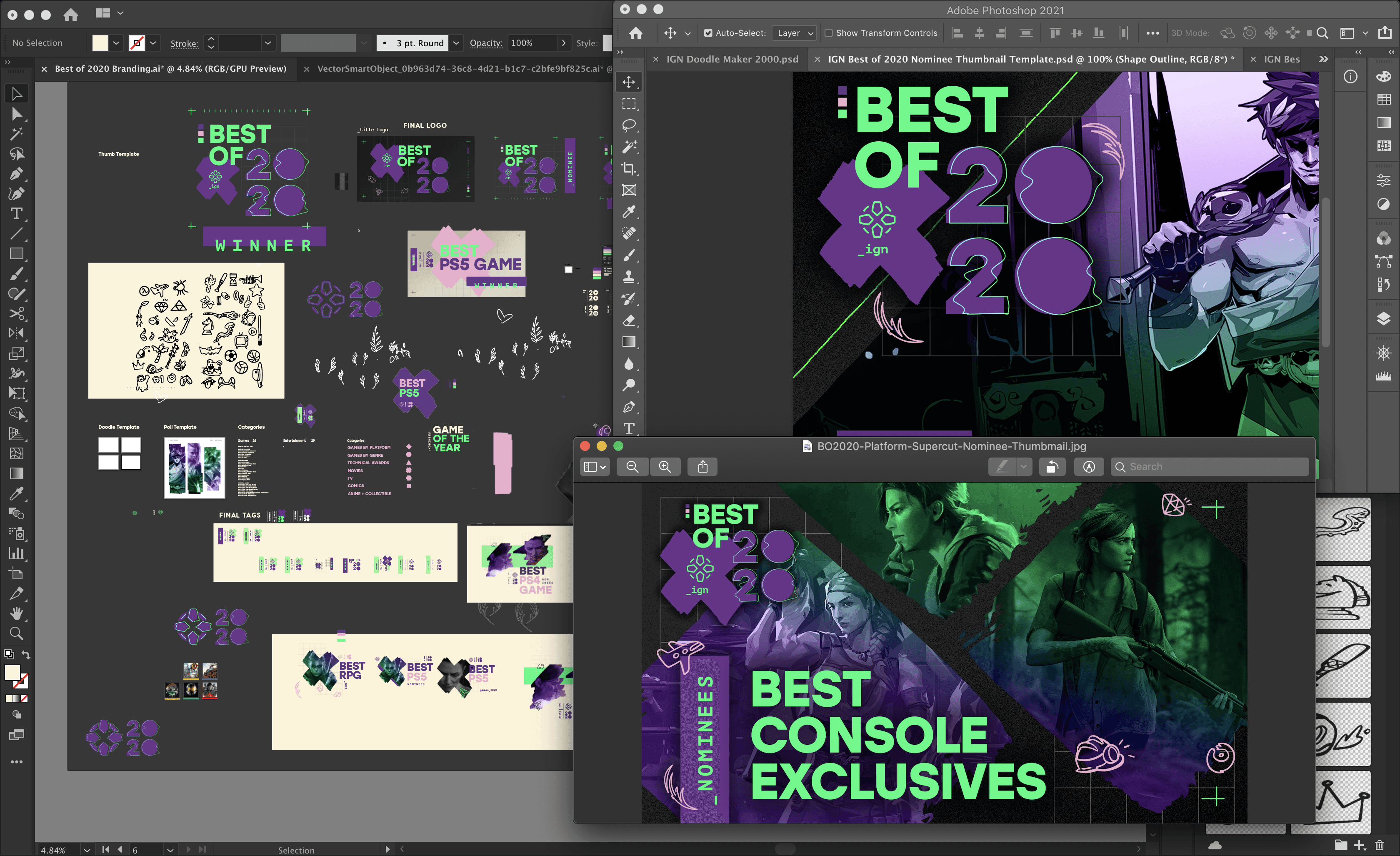
a look into my process
My illustrator artboards are always a treasure trove of forgotten designs and 10s to 100s of variations on the branding I’m doing. I love working with a canvas in this way as just a catch all for throwing ideas, imagery, color, typography and whatever else comes up.
These artboards also make for a fantastic resource to pull old designs and re use them for new projects where maybe an old forgotten design could fine new life.

