


IGN Entertainment • IGN • 2019
IGN Best of 2019
Overview
Role(s): Lead Designer, Art Director
IGN’s end of year coverage is a tentpole event for the brand every year and 2019 was no different. It was a strong year for the entire entertainment industry and with that I wanted to represent the titles in a new and vibrant way
My Responsibilities:
• Best of 2019 logo
• Thumbnail design strategy/execution
• Motion graphics art direction
• Promotional design strategy/execution
• Social design strategy/execution
• Illustration art direction
Approach
Most end of year events like this follow a standard Oscar like, regal visual approach that leans into dark colors, blacks, golds, etc. For this coverage I wanted to go in the opposite direction and make something colorful and vibrant.
I collaborated with two talented illustrators on my team (Angela Nguyen and Julia Rago) to help create the illustrated characters/objects. I wanted the whole thing to feel organic and inviting and I feel like we achieved that and made IGN stand out from the pack.

Stickers for Best of 2019
Illustrations: Julia Rago + Angela Nguyen
A special leave-behind
The illustrations produced for the event were such a hit amongst staff that we decided to make them into commemorative stickers. We printed about 300 of them to hand out and use for future events as well for fans. Julia Rago and Angela Nguyen’s work shined on these in particular.

Nominee and GOTY badges sent to publishers/devs
Game of the Year reveal video
Presenting the awards
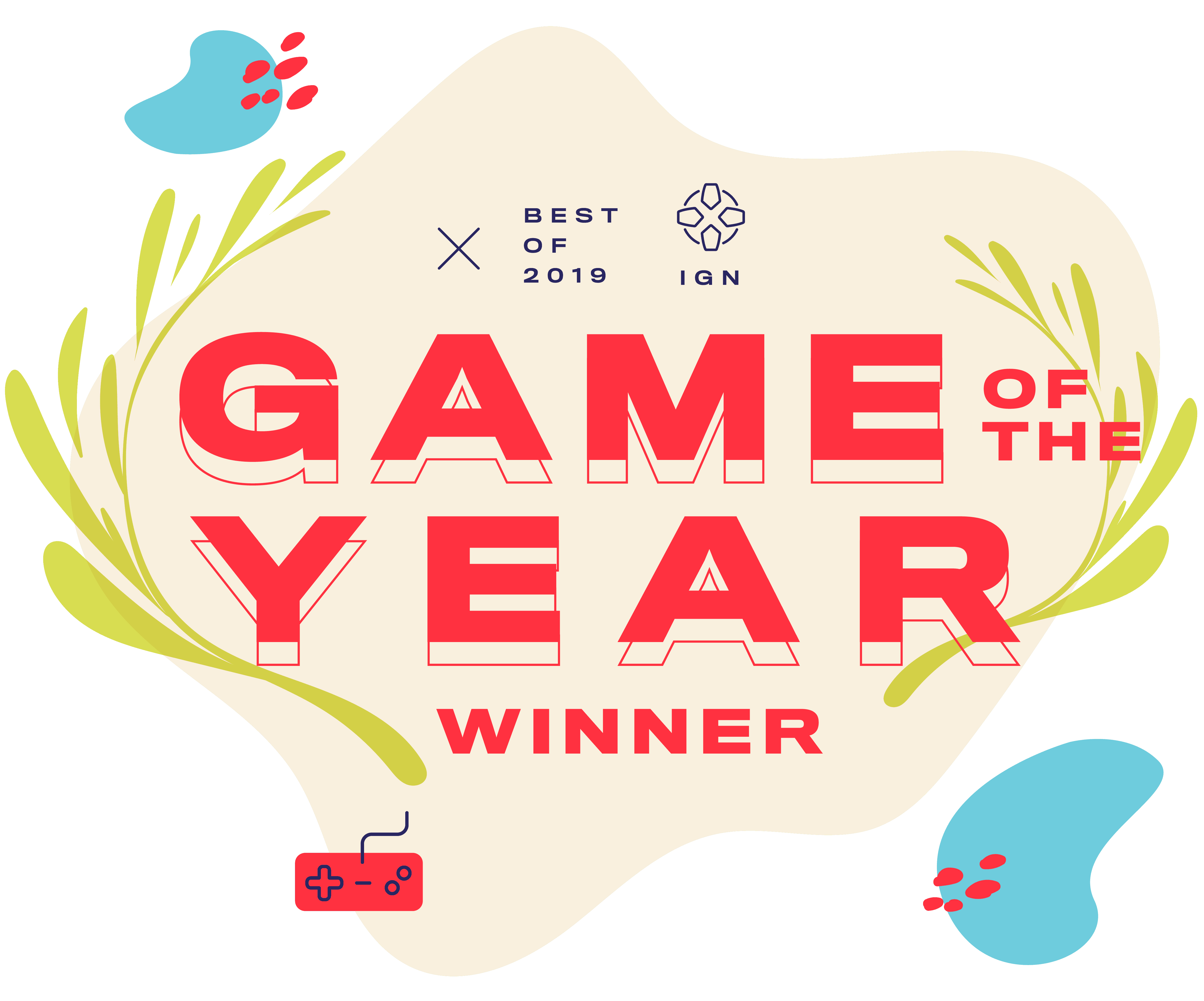
Typography is always top of mind for me and this project was no different. Throughout the motion graphics and into the static assets as well, having bold typography with bold size contrast was a key aspect of the style for 2019. This bled into our handouts for the awards themselves as well from nominee badges to full on GOTY badges.

Example of a slide delivered to motion graphics for reference

Icons developed for each category
Illustration: Julia Rago
Icons and colors
Besides the illustrations, the key aspects of the style for 2019 were the colors and icons we used to fill in the compositions across all use cases. With the help of Julia Rago I created a set of colors and icons that fit the style and allowed us to add that extra finishing touch to each piece.

IGN’s YouTube page during BOTY 2019

IGN’s Twitter page during BOTY 2019
Social presence
No matter where an event brand exists, it should have a unifying message. This event was one of the most successful I have put together in my time making editorial feature graphics like this. That same theme was kept consistent and managed across any corner of the internet it showed up, from YouTube banners to Twitter to Instagram.


A sampling of the thumbnails from the year
Thumbnail approach
The thumbnails for each category achieved a level of simplicity I was looking to pull off for a long time in a project. Through the re-use of our core elements (illustration, wave pattern, branding, typography) we were able to create a set of thumbnails that all felt custom yet they were put together much quicker than what would normally take 3-4x as long.
Previous project

Next project
