
IGN Ent. • 2020
Xbox Series X|S + PS5 Console Launch Feature

Role(s): Lead Designer, Art Director
The launch of a new console generation only comes along every 8-10 years and with it comes excitement and promises of new experiences for years to come. Generation nine represents the launch of the Xbox Series (Series X and S) of consoles from Microsoft as well as the PlayStation 5 from Sony. This type of event is about as big as one gets for a media outlet and will see its highest traffic in years for those next few weeks. With this comes the need for a stylistic approach that matches that excitement and feeling of hope for the future
My Responsibilities:
• Thumbnail design strategy/execution
• In-article editorial imagery
• Motion graphics art direction
• Promotional design strategy/execution

the xbox series x banner used on our homepage

and its corresponding playstation banner

my final canvas of madness
Once again I made my Illustrator cry with pain by creating this collection of assets. In reality I ended up breaking these out into their own individual files for use by others. This file still represented the place where I could ideate and try new layouts quickly. It worked especially well as a canvas for typographic exploration as well


the lead thumbnail and controller thumbnail used on ign.com

te ign.com homepage the day of launch
As i have stated above, I wanted to achieve a strong contrast between the looks of both of these consoles visually. It was a fairly easy decision to lean into the colors and aesthetics of the consoles themselves physically. With PlayStation i went very light and airy with splashes of their brand blue throughout.
Overall the approach was to let the hardware and games be the star though, with the typography and shape elements serving as the texture for the overall set of coverage pieces.

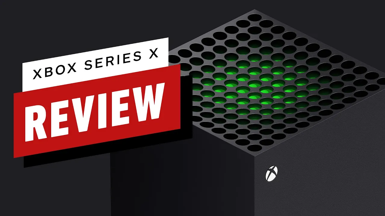
xbox series X thumbnail used on ign.com

xbox series s thumbnail used on ign.com

the ign.com homepage on launch day
The Xbox Approach
Just like with PlayStation I wanted Xbox to have its own identity. The fun aspect of this was that Microsoft produced two consoles for this generation in the Xbox Series X and Xbox Series S. This gave me an easy way to differentiate the aesthetic off the bat since one console was predominantly a darker color than the other.
and just like with PS, I made the hardware the star of the show and let the extra design elements become a backing for the product shots.

how our review looked live on youtube
the thumbnail used for ign.com
the thumbnail used for youtube
As you can see in my project overview for the Youtube thumbnail redesign, we had established a very consistent look and feel and we wanted to continue that for the release of these consoles. The decision was made to make the thumbnails on ign.com a little more exploratory visually while the youtube versions maintained the style our audience at this pint had come to know and expect


some examples of the motion graphics frames i gave to will
While it wasn't a large focus of the video reviews, our motion graphics took inspiration from my established editorial look and adapted it for the intros, transitions, lower thirds and informational callouts as seen here. I worked with our motion designer Will Batchelor to develop the look and feel for our final video reviews you see above/below for PS/Xbox
IGN's full review for the xbox series x