

Red Ventures • Giant Bomb • 2021
Giant Bomb Game of the Year 2021 Branding
Overview
Role(s): Lead Designer
Giant Bomb does end-of-year coverage differently than most outlets. There’s no over-the-top, flashy awards-show feel. Instead the staff air their Game of the Year discussions live and take the audience behind the curtain on how it gets decided.
My Responsibilities:
• GOTY 2021 logo
• Thumbnail strategy and design
• Promotional strategy and design
• Social strategy and design
• Stream graphics strategy and design
Approach
The focus isn’t the games, it’s the hosts and the brand, so I played that up. Putting the Giant Bomb brand and logo first made it feel special and important, and reminded people why they come to Giant Bomb for GOTY coverage. Keeping it this straightforward cuts through the noise and promotes the brand in a vibrant, colorful way.
Key decision
The brand first, not the games. The hosts loved it. The games are the discussion and the meat of the content, but the brand and its voice are the real seller.
Results
20 assets in 2 weeks
As the only designer, I made about 20 assets in two weeks, working directly with the editors.
A week of live coverage
A full week of 3 to 5 hour daily streams drew 2 to 3k concurrent viewers each day.
Every GB platform
One mascot-led look ran across every Giant Bomb platform, from Twitch overlays to winner art.

GOTY 2021 Day 1 live on Twitch.tv
Live and alive
Like the majority of Giant Bomb’s content these days, there was a need for stream overlays to make the event of GOTY feel like it was still special and something you don’t see often. I went with a simplistic approach visually and let the colors be a nice backdrop for the content to sit on, I’m always a sucker for a vertical logo as well so it felt natural here with the proportional size 16:9 I had left.


The artboard for the branding this year
Giant Bomb 2021
Branding GOTY
Initially I wanted to go with an even stronger typographic approach but when I started to apply it to assets it took away from either the content or the GB brand and that wasn’t where we wanted this to sit. Sticking with just GOTY and not spelling it out (while trusting the audience to know) allowed the brand to be used many more places than before.
Key decision
“GOTY”, not spelled out. The Giant Bomb audience is tuned in and hardcore, so the term needs little explaining. That shaped how much the visuals had to explain. The short form also fit many more places.

Social post template developed for GB
Social approach
For posting clips of certain discussion pieces I developed a template the team could use. It had editable spaces for each day and for the headline spaces as well with a 16:9 frame to go with. I was happy with how this came out from a branding perspective and something that would stand out on a social feed.

GB GOTY 2021 Day 1 thumbnail gradient

GB GOTY 2021 Day 2 thumbnail gradient
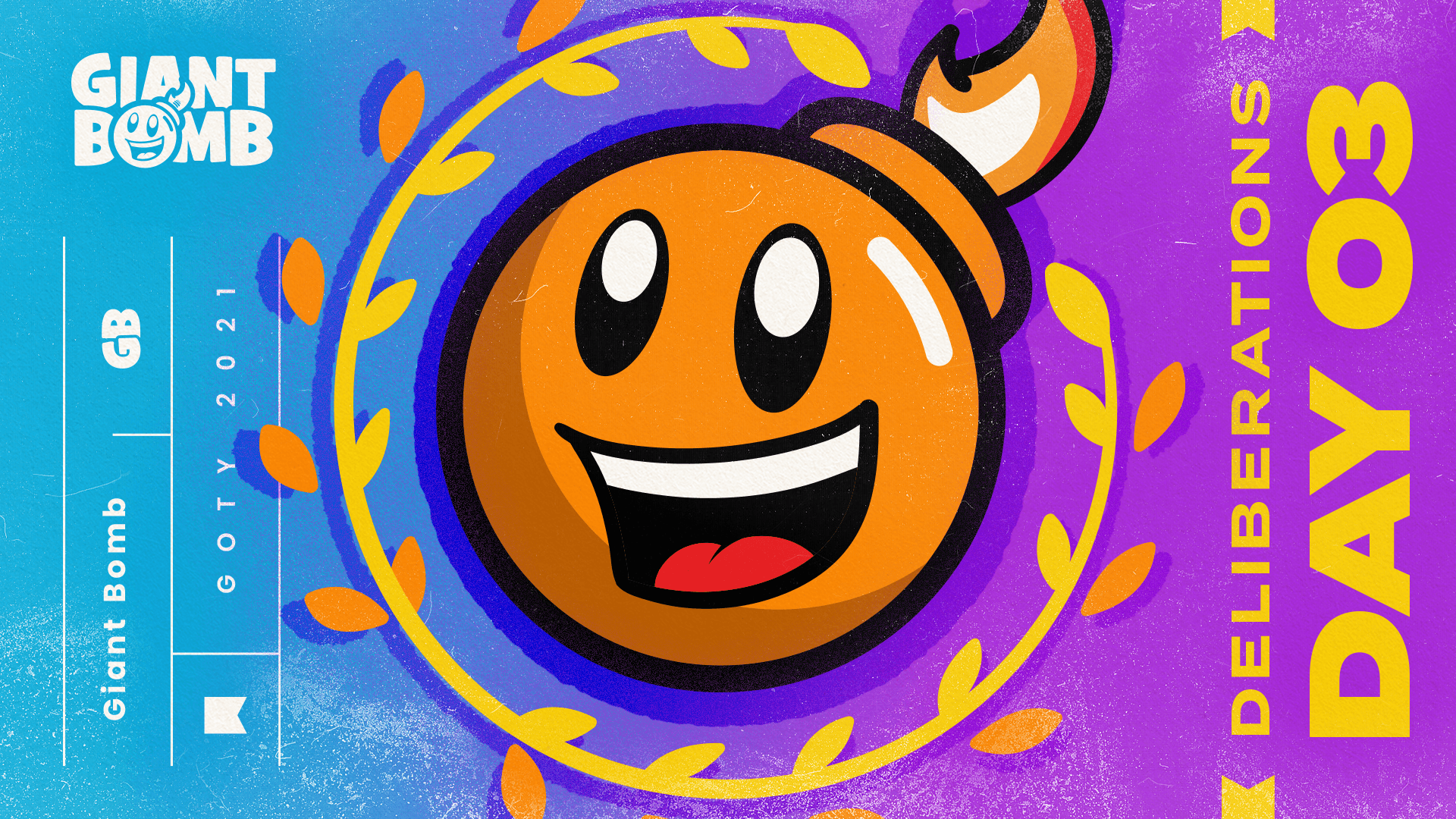
GB GOTY 2021 Day 3 thumbnail gradient
Giant Bomb 2021
Thumbnails can be pretty too
I had a simple goal when developing these thumbnails, to create something that would graphically stand out on tv sets, laptop screens, phones, wherever. The way I achieved that was setting up a 4 part gradient that would link between thumbnails day after day while promoting the day number second in the hierarchy behind the Giant Bomb logo.
Even with the repetition of the GB GOTY logo I made, the drastically different color backdrops helped make the thumbnails still feel elevated.
Key decision
A four-part gradient across the days. The color strategy aimed to catch the eye of someone browsing YouTube, where thumbnails were hard to win. It had to feel like Giant Bomb and stay memorable for years.

Day 3 thumbnail live on YouTube
Live in action
When the time came for the thumbnails to actually be put up, my goals were well realized. The art stood out well from a sea of other thumbnails and had a strong visual core that might at least intrigue people who didn’t previously know Giant Bomb before now.

Thumbnail for our guest articles

Game Mess Mornings
Giant Bomb 2022
The overall choice
For the winner art I wanted to continue the use of the centerpiece motif where the GB GOTY bomb had originally sat. For the overall winner art though it felt like a nice opportunity to highlight the game and push the GB brand a little more secondary. It made for a nice plaque of sorts for our friend Greg Lobanov and Finji, who made the game Chicory.
Previous project

Next project
